Case Study 1 :
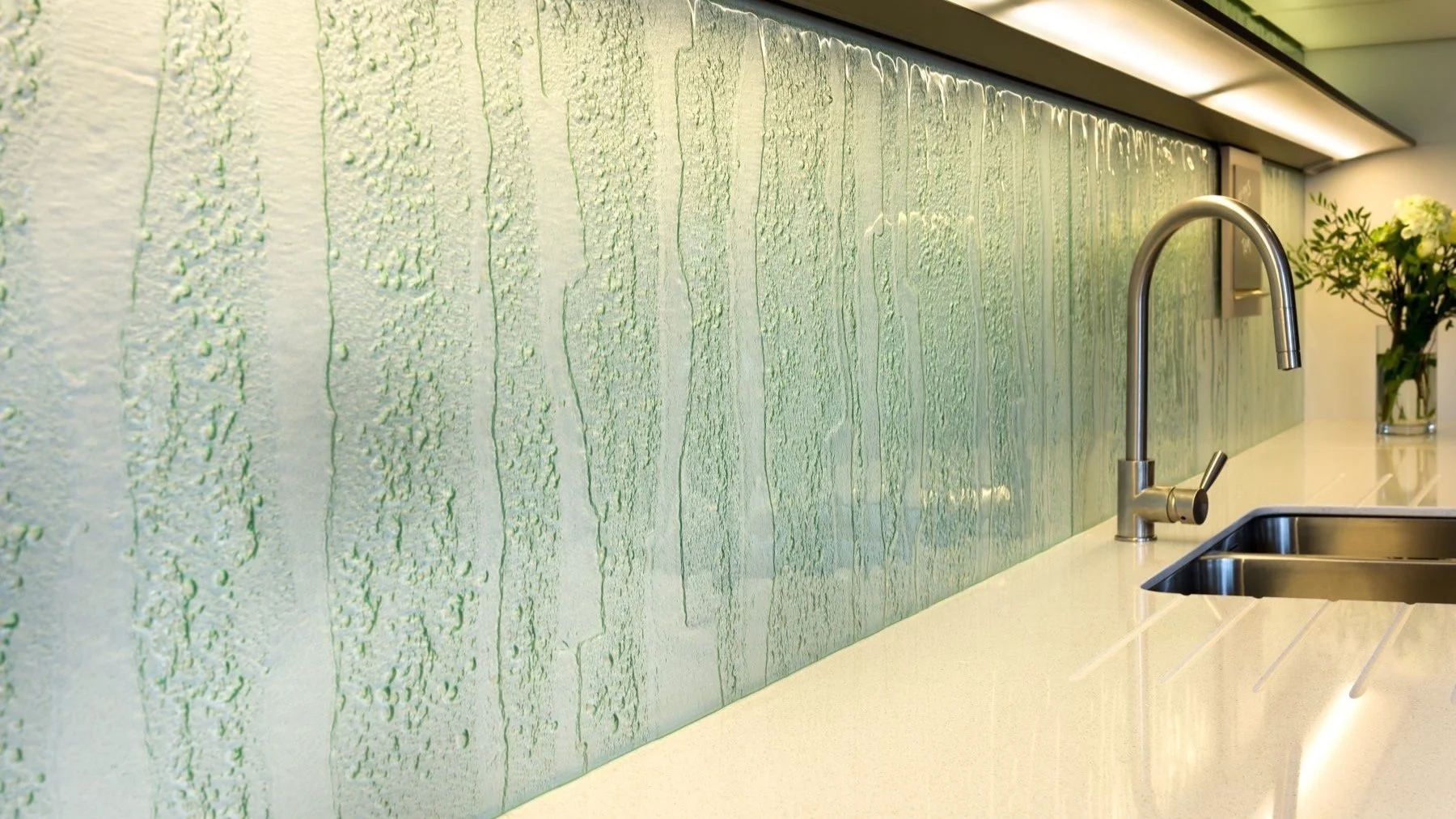
‘Waterfall’ bespoke glass : Splash back for a contemporary kitchen.
The clients for this project really loved the effect of my textured glass and commissioned me to fill this 3 + metre long space with my ‘Waterfall’ texture. The texture is cast into the back of the glass and mounted against the wall leaving the smooth surface on the face.
The sleek lines of their Sie Matic kitchen work so well with the calmness of the glass. The light green tint of this bespoke glass comes alive when light hits the texture..
As the glass was fitted behind a sink area, it happily sat directly onto the worktop as heat was not going to be an issue. (Behind a cooker I recommend the glass sits on an upstand).
The integrated lighting strip in the shelving made the top shorter section of glass become quite vibrant as the light passed through it. This added a wonderful variation to the two areas.
Due to the width of glass needed, the splash back had to be made in 2 parts. (The maximum size of glass I can create in one piece is 2 metres). I joined the glass behind the tap to give a defined, purposeful line.
“A simple but effective glass, easy to live with and with longevity”.
This glass type is available as a standard texture and a sample piece can be ordered through the ‘shop’ section of this website.
It is available in light green, crystal clear, grey and bronze.
Case Study 2 :
‘ The Chapel Gallery’, Ormskirk : Windows for the gallery facade.
I was awarded this commission after my proposal submission, experience of working on previous commercial projects and teaching experience.
The gallery had been awarded a grant to reconfigure the internal spaces and install a lift to expand community spaces by giving access to the upper floor. The architectural glass commission was to create 2 features, one to the front facade of the building and the other to the side.
The Project
I proposed to use visual references from the internal spaces of the building and from the existing stained glass which was to be removed as part of the redevelopment.
The large glass panels were to be made using a laminated glass technique I had been developing for a few months, although I had only explored this through small scale sample investigations to this point.
My idea for this brief was to create a contemporary take on stained glass. I laser cut and hand perforated card and fabrics to reference the opaque, traditional leaded lines. Metals, fabrics, hand painted silks, coloured films and threads were incorporated.
Manufacture
All the components for the windows were created in my studio, it was strange but equally liberating to be not working with actual glass! I spent weeks painting fabric, assembling laser cut components, stapling pieces together with copper, hammering metal wires. (All these elements were tested through samples to ensure would survive the lamination).
Once I had all of the panels assembled in three sections, I transported them to Merseyside for the final assembly in-between the toughened glass and firing in the laminating kiln. (see images to the bottom left). The laminating kiln was large enough to take all three panels in one firing. The glass is wrapped and heated to only around 120 degrees centigrade (a lot less than kiln-forming glass). The glass is also put under pressure during the process to ensure the unit is sealed tightly.
Image below shows the glass in the processing factory once laminated.
The final stage was to have the glass made into three double glazed units before being installed.
Working with young people
As part of the commission I was assigned to work with amazing groups of secondary school students ranging in age from year 7 to year 9. I taught visual workshops for one day a week for 6 weeks.
An initial meeting was held in the gallery where the students visually recorded the internal spaces through sketching, exploring perspective, line, form and shape.
The following workshops were held at the school where students began to process their drawings through various guided exercises, playing with scale and looking at transparency and opacity.
We worked on large scale collages editing and layering elements of early drawings and then developing through to laminating colour gels and papers to investigate the play of light.
Side Elevation Window
When I initially submitted the costings of the project, I had stated that there would not be enough money to manufacture the side elevation windows to the same specification as the front windows so I proposed installing a window film over the three panes of existing glass which would create an injection of colour and pattern in a corridor space.
The effect, as seen here, was really successful. I created the design using photoshop and illustrator and had the window film digitally printed.
I think it was more nerve wracking installing this than the actual large double glazed units !
Case Study 3 :
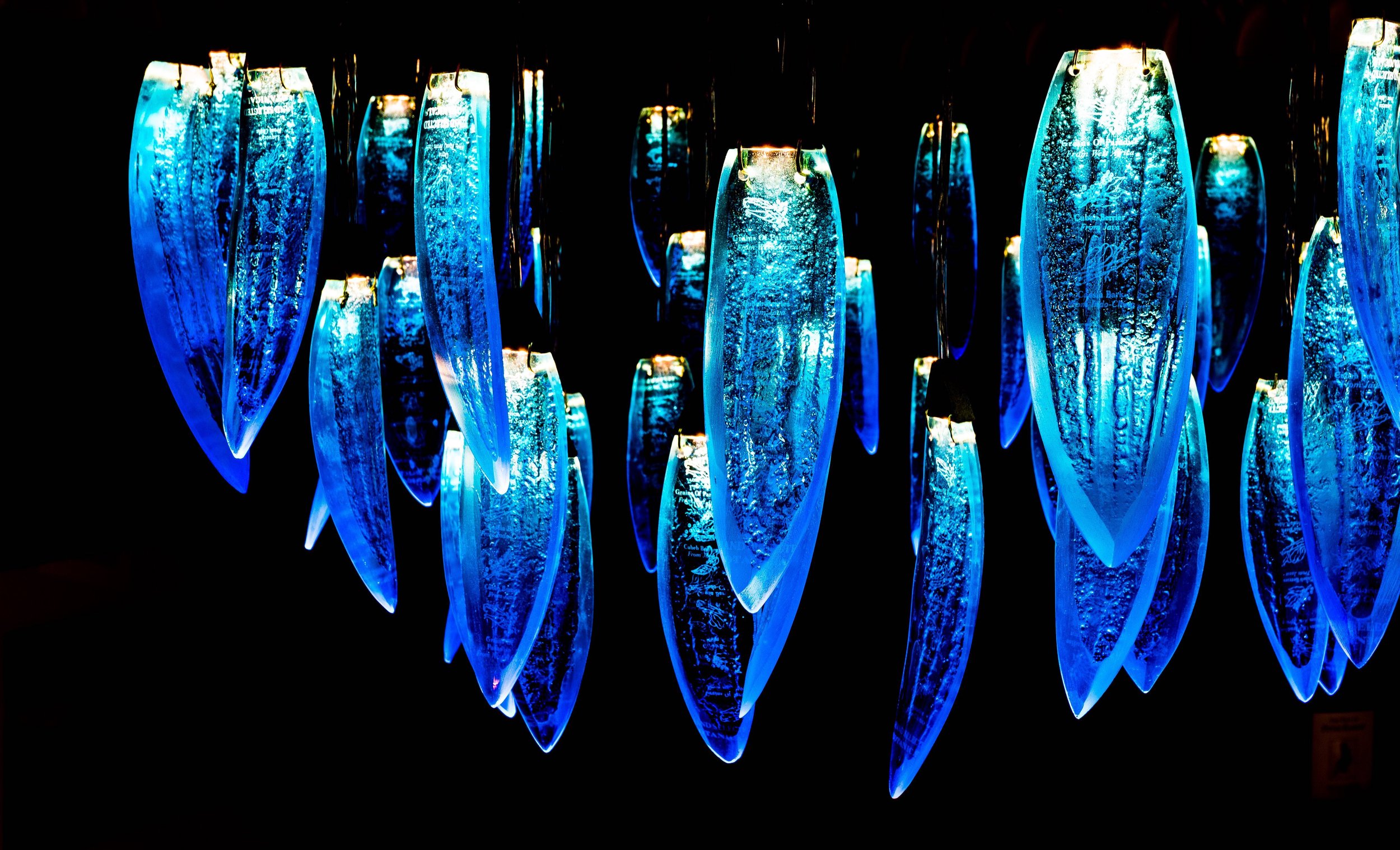
‘Bombay Saphire Chandelier’ - Cedar Manor Hotel, Windermere.
This small, family run hotel approached me to discuss a lighting feature for their soon to be refurbished reception room.
Part of the brief was to recycle glass bottles from the bar. Being a part of the hospitality sector, the clients felt a strongly about recycling and wanted an overall eco approach to the hotels refurbishment. This set a some great challenges, firstly I did not want the chandelier to resemble any for of a bottle. I have seen many a glass project where bottles are slumped flat in the kiln and that is not what I wanted. Secondly, it is difficult to kiln form random glass bottles due to potential compatibility issues. What I mean by this is, if glass is not compatible with each other then stresses build up in the glass when fired together and this ultimately leads to cracking.
After some discussions we looked at various gin bottles and the colour in particularly that of Bombay Sapphire gin bottles.
The next stage was to test the glass, create some designs, fire it in the kiln and test with an artificial light source.
I came up with the leaf form for a couple of reasons. A feature of the hotel is this large, old Cedar tree that dominates the entrance. Therefore the shape is a leaf form, also it allowed me to utilise the sides of the bottles therefore getting 2 leaves per bottle (each consisting of 2 layers).
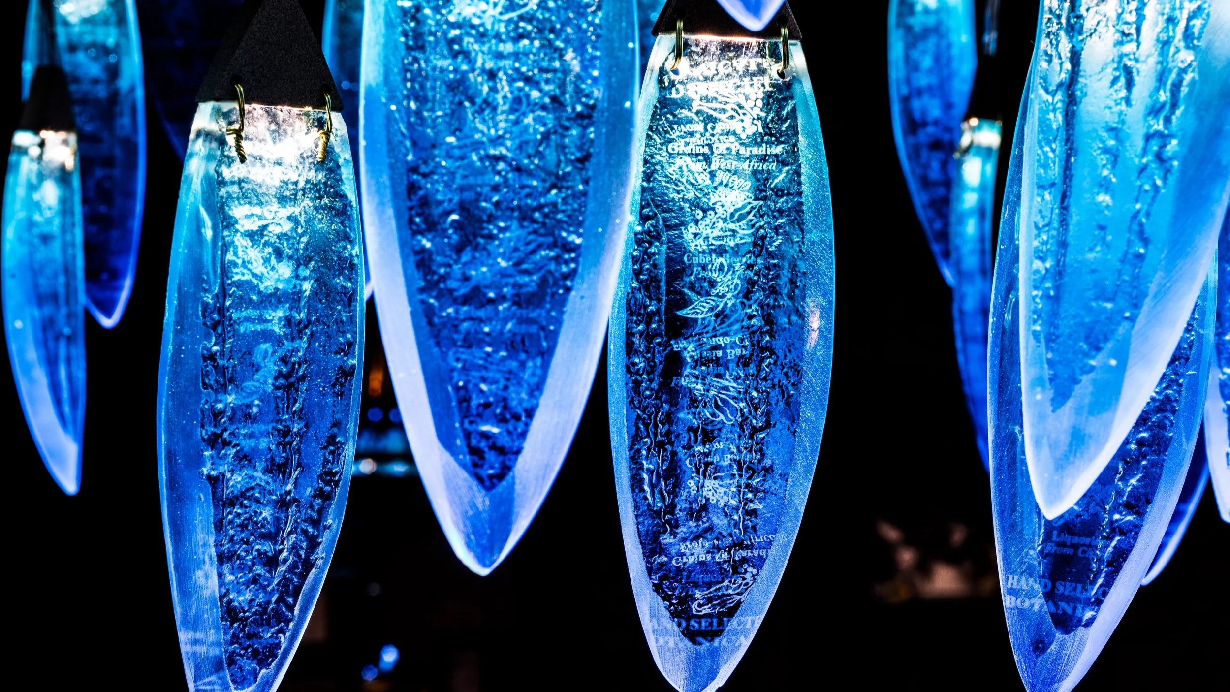
Once I projected light through the glass, the botanical etched information on the side of the bottle illuminated and this was quite a magical accidental happening. (See detailed image to the right).
Production
The glass pieces were cast individually onto hand made moulds to pick up leaf vein textures.I then ground and shaped the pieces to taper the edges and give a more delicate feel.
A second firing bent the glass into shape, the glass was then drilled with two holes and attached with wire to bespoke aluminium triangular housings which the LEDs sat into.
Each aluminium triangle housed two LED diodes which were designed to fire light down through the individual glass elements.
The glass was then wired into the bespoke made stainless steel fitting (see above) and then delivered to site for installation.


